The tools you use every day in church life should feel familiar and dependable, while continuing to evolve alongside the changing needs of ministry.
That's why we've been working on a significant design update across ChurchSuite. Today, we're excited to introduce a refreshed experience, share the new features it brings, and show you how easy it is to get started.
Still ChurchSuite – just refreshed
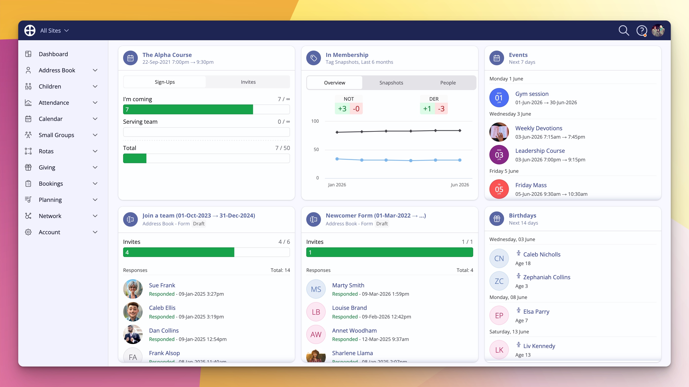
When you switch over, the first thing you’ll notice is that it still looks and feels like ChurchSuite. The familiar blue bar is still there. The overall experience is recognisable, so there’s no steep learning curve. We’ve introduced some new design language and tidied things up, but the heart of the product remains exactly what you know and trust.
Faster, more direct navigation
One of the biggest improvements is how you move around the system. The navigation has been reorganised so you can expand any module in the menu and jump straight to the exact section you need – for example, straight into Giving > Statements – without extra clicks.
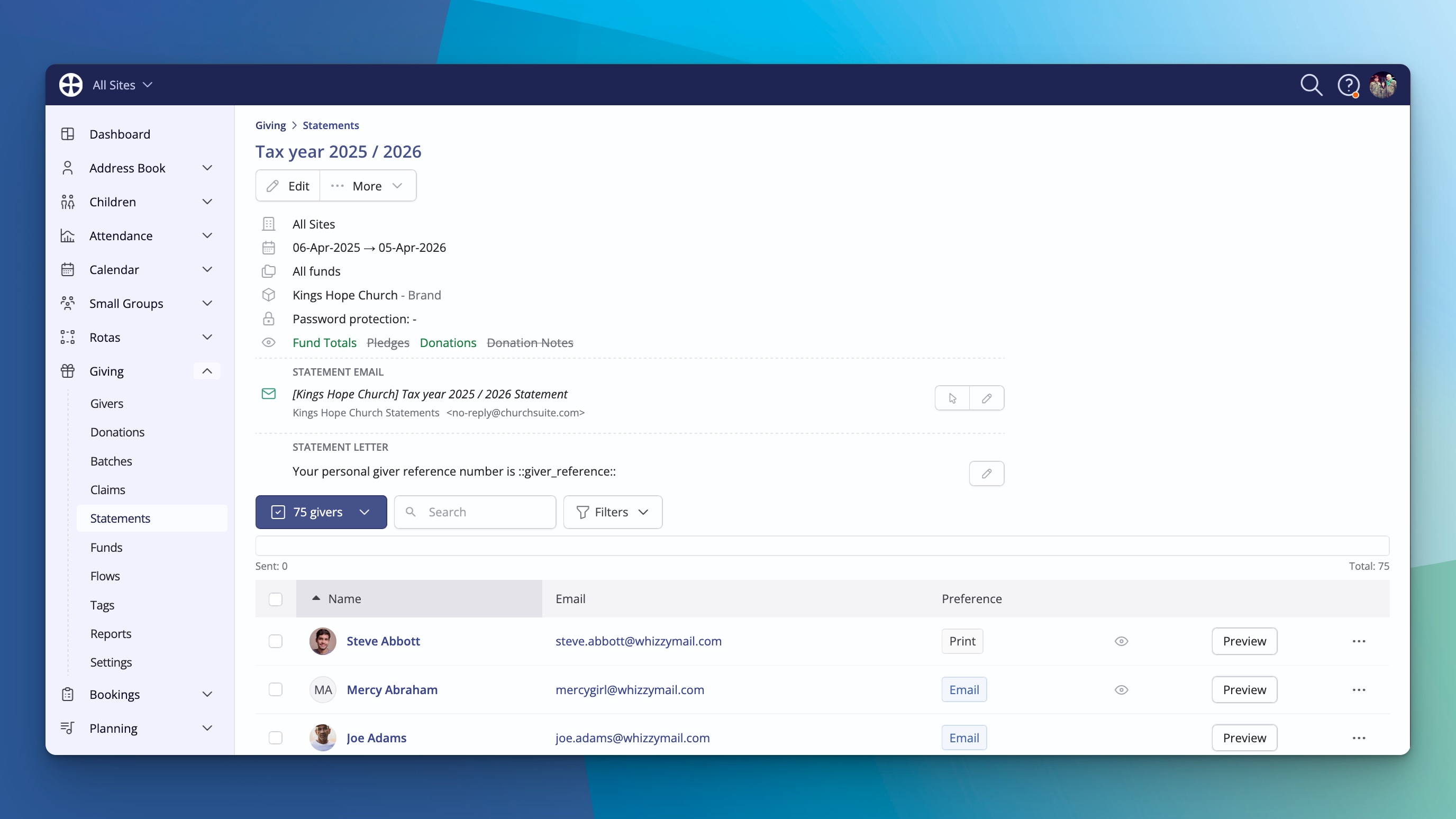
It feels quicker and, in many ways, makes the whole product feel a little simpler. You spend less time finding your way and more time getting things done.
Contact pages that work the way you do
We’ve added some thoughtful touches to the pages you visit most often.
You can now customise the widgets that appear on any contact profile. Want the Flows widget to always be visible? Just turn it on and it will stay there for every person you view. No more digging into the Engagement tab every time.
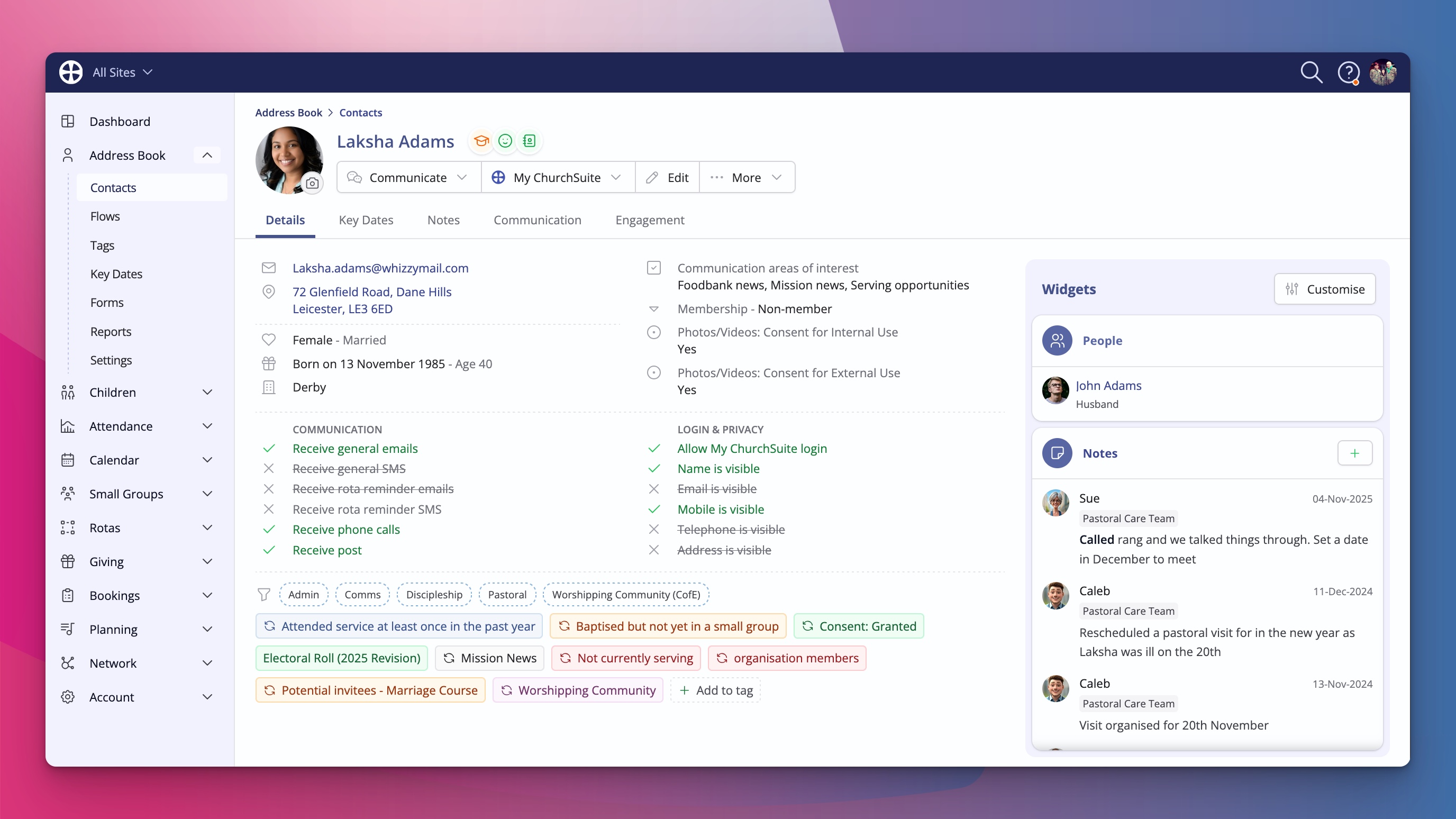
Notes have moved into their own dedicated tab. This gives the information more breathing space and makes longer notes much easier to read. However, if you want the notes to show on a contact's Details tab, there's a Notes widget you can add. It’s a small change that makes a big difference when you need everyone to stay in the loop.
We’ve also added breadcrumbs across the top so you always know exactly where you are in the system and can navigate back with confidence.
Smart Search that actually feels smart
Finding things just got a whole lot faster. There’s now a powerful smart search icon at the top of the screen. Type something like the name of a member and ChurchSuite will surface relevant flows, tags, key dates, events, forms, groups – anywhere the term appears – all in one place.
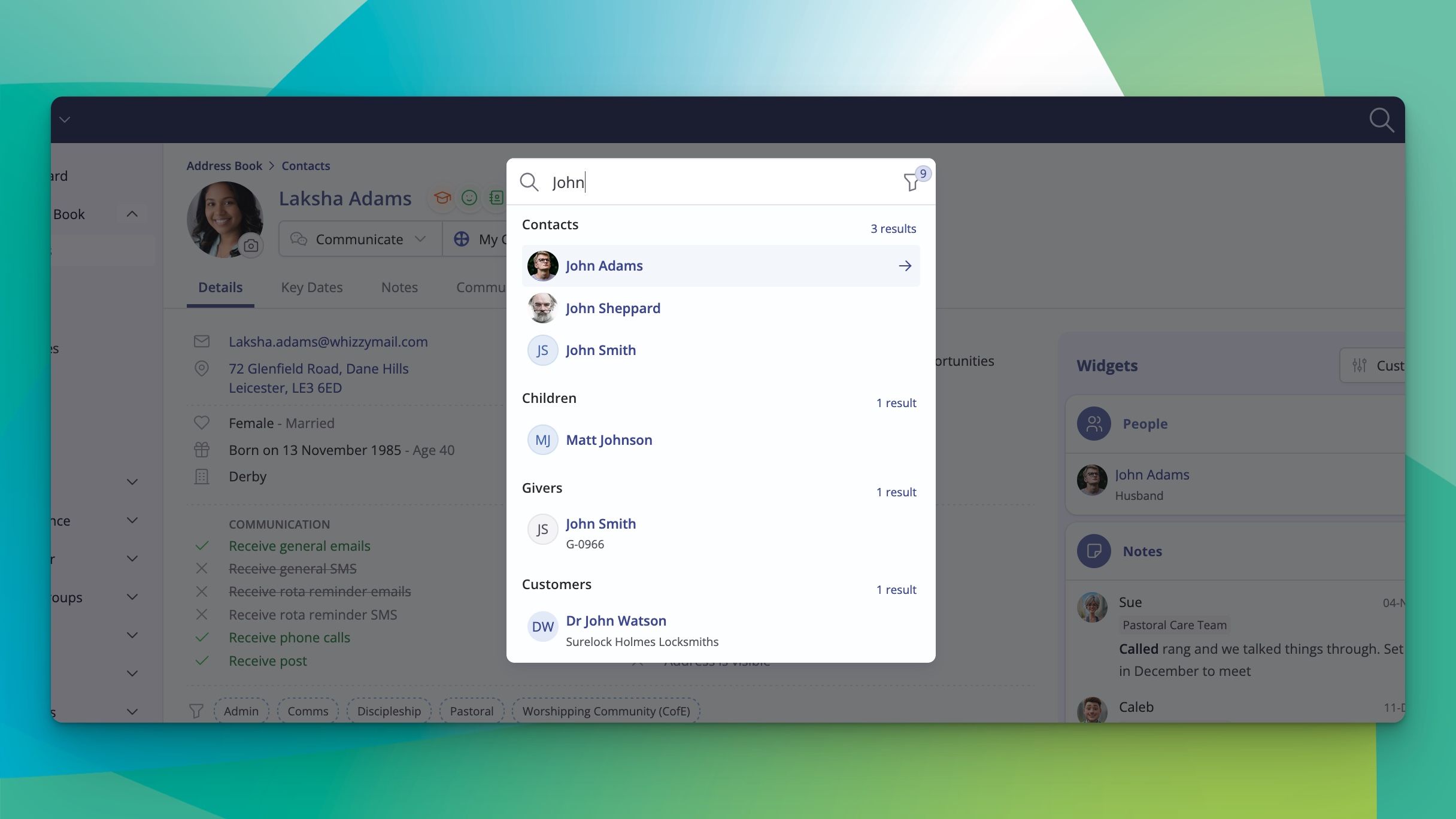
You can even restrict the search to a specific module if you want to narrow it down. And the best part? You can open this search from anywhere in ChurchSuite using a simple keyboard shortcut: Command+K on Mac or Control+K on Windows. It works like a command palette – type, arrow through results, hit Enter, and you’re there. Whether you’re deep in a booking or just want to jump to your own profile, it’s incredibly quick.
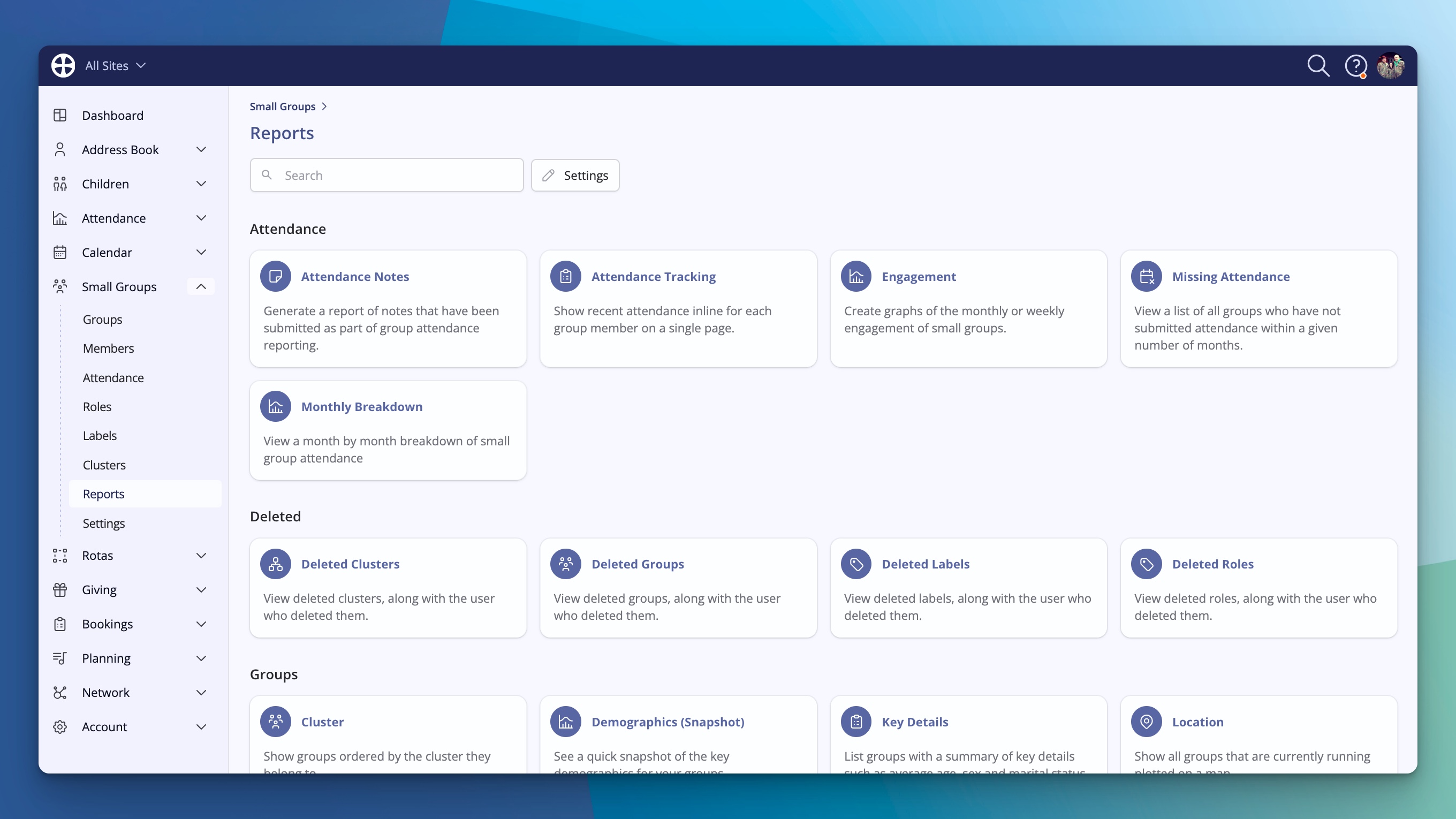
Polished throughout
We’ve given the Reports section and module settings areas a facelift too, so the whole experience feels consistent and modern. Every part of ChurchSuite has been reviewed to make sure the new design works neatly together and looks fantastic while staying true to what makes ChurchSuite, well, ChurchSuite.
How to try it today
The new design is available right now. Simply click your user menu (top right), choose the option to switch to the new design, and everything will update instantly.
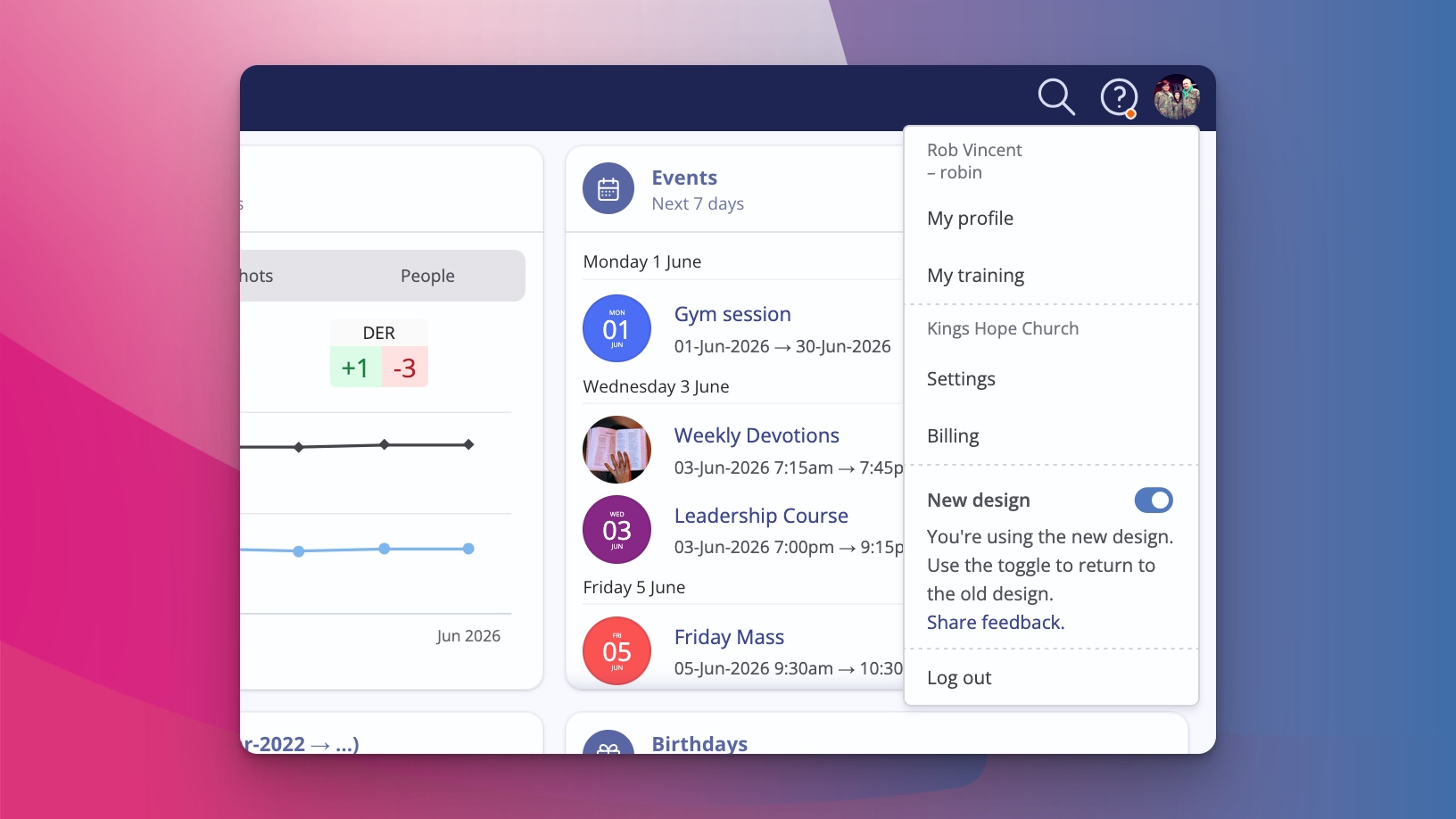
If you ever want to switch back to the classic layout while we finish rolling everything out, you can toggle it off again just as easily. For now, you’re in complete control of which experience you prefer.
We’re really excited to get this into your hands. We believe the combination of a fresher look, smarter navigation, customisable views, better readability for notes, and that powerful new search is going to make your day-to-day work in ChurchSuite even more enjoyable and effective.
Log in, give the new design a try, and let us know what you think. Your feedback helps us keep shaping ChurchSuite into the best possible tool for churches like yours.